
Before you choose a color, a font, or a tagline, you choose a shape. And for a century, the most deliberate brands have chosen the same one.
What the Brain Reads Before the Name
The circle has no sharp transitions — no start, no end. That continuity registers subconsciously as safe. Research published in the Journal of Consumer Research found that circular logos are perceived as “warm and welcoming,” while angular logos read as “efficient but aggressive.” Neither reading is wrong; they’re just different positions.
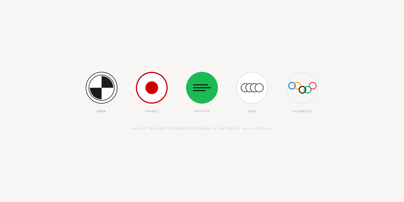
Starbucks, BMW, Target, Audi, Spotify, the Olympics — none of these brands landed on circles by accident or convention. The shape does specific work. It signals inclusivity, because circles carry no hierarchy. It signals permanence, because a closed curve implies completion. It signals that the brand is approachable before a single word is processed.
If the brief says “community” or “trust” or “timeless,” the circle isn’t the obvious answer. It’s the correct one.
Kandinsky Put It in Writing
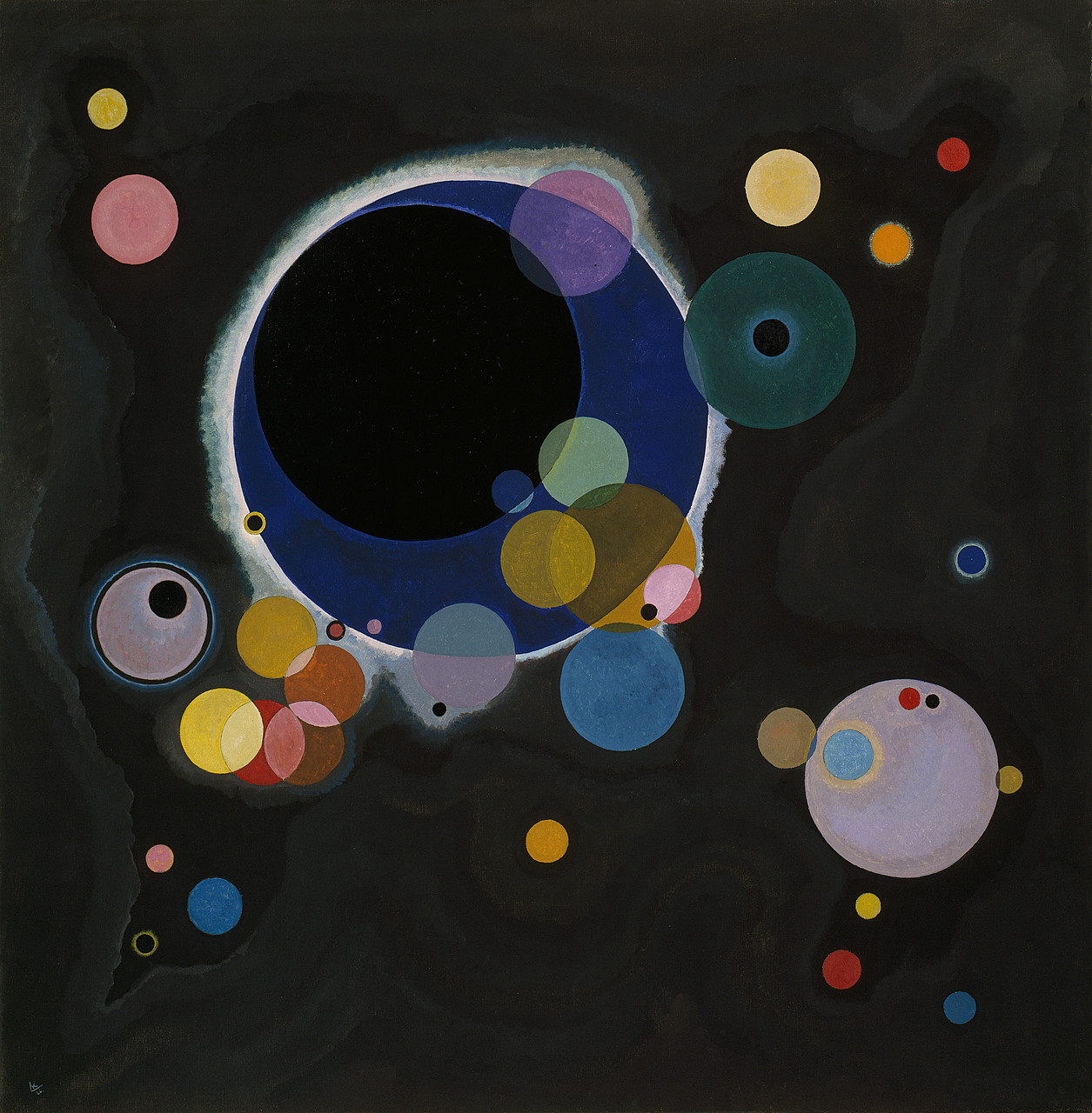
In 1922, Wassily Kandinsky joined the Bauhaus in Weimar and began what would become his Circle Period (1925-1928). He didn’t just paint circles. He theorized them.
His conclusion: “The circle is the sum of all the greatest opposites. It combines the concentric and the eccentric in a unique and balanced shape.” He ran questionnaires mapping primary shapes to primary colors. Students across the Bauhaus workshops converged on the same answer: triangle equals yellow, square equals red, circle equals blue — the color of depth, cosmos, timelessness.
That grammar didn’t stay in Weimar. It runs beneath every trusted circular logo made since. When a brand designer reaches for the circle because it “feels right,” they’re often reaching for something Kandinsky had already systematized a hundred years ago: the idea that the circle points toward something larger than itself.
Apple and the Shape That Isn’t Quite a Circle
The circle evolved. In digital design, a perfect circle creates tension with a rectangular screen. The solution came from mathematics.
Gabriel Lamé, a French mathematician working in the 1830s, generalized the ellipse into the formula |x/a|ⁿ + |y/b|ⁿ = 1. Raise the exponent above 2, and corners begin to soften. At n=4, you get a squircle. Danish polymath Piet Hein applied this to the design of Stockholm’s Sergels Torg plaza in 1959 — a public space “neither round nor rectangular, but in between. Yet it is fixed, it is definite — it has a unity.”
Apple’s iOS 7 app icons, introduced in 2013, extended that idea further. The shape most people call a squircle is technically a quintic superellipse at n≈5. The distinction matters: a conventional rounded rectangle has circular arcs at the corners that snap discontinuously into straight edges. Apple’s shape maintains continuous curvature all the way around — no mathematical break, no perceptible transition. The corner flows.
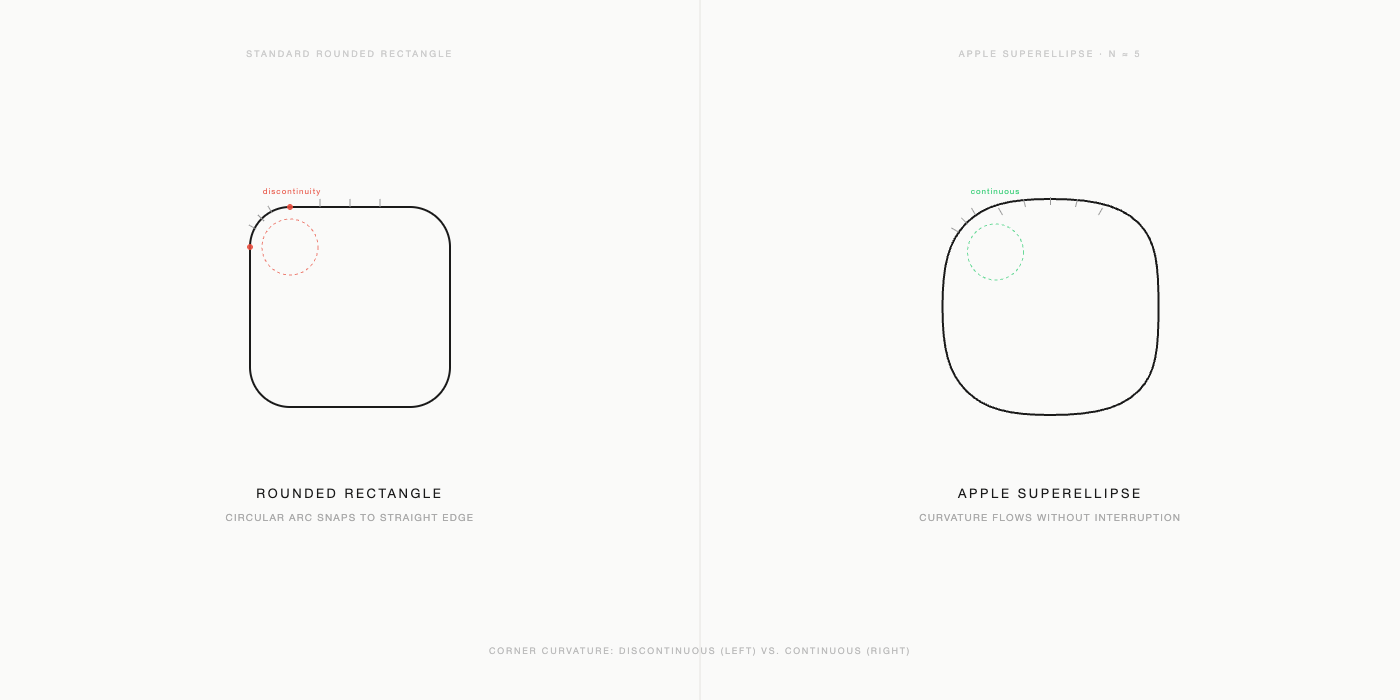
Apple never published the geometry formally. Designers reverse-engineered it. That the company spent engineering cycles on the mathematical continuity of an icon frame — a detail almost no user could consciously name — is itself a statement about how seriously shape craft operates at the highest level.
Takeaway
Shape isn’t decoration applied after the strategy is set. It is the strategy’s first statement. The Bauhaus understood this philosophically. Apple proved it technically. If the circle keeps appearing in the work of the most intentional brands across a century, that’s not coincidence — it’s evidence.