
In October 2025, PepsiCo released its first new corporate logo in 25 years — and for the first time in the company’s 60-year history, it contains no trace of Pepsi.
A Logo That Quietly Became a Lie
PepsiCo was born in 1965 from a merger of Pepsi-Cola and Frito-Lay. The founding logic for the corporate identity was straightforward: Pepsi was the dominant asset, so the corporate mark borrowed its globe, its red-white-blue palette, its typographic register. Everything said Pepsi.
That logic held through the second identity in 1990 and the third in 2001 — a clean globe-and-wordmark arrangement that would go untouched for the next 25 years. The problem: the company didn’t stay still. It acquired Gatorade, Quaker Oats, Tropicana, Tostitos, Doritos, Mountain Dew, and eventually poppi and Siete. By 2025, PepsiCo managed a portfolio of over 500 brands. The corporate identity still looked like one of them.
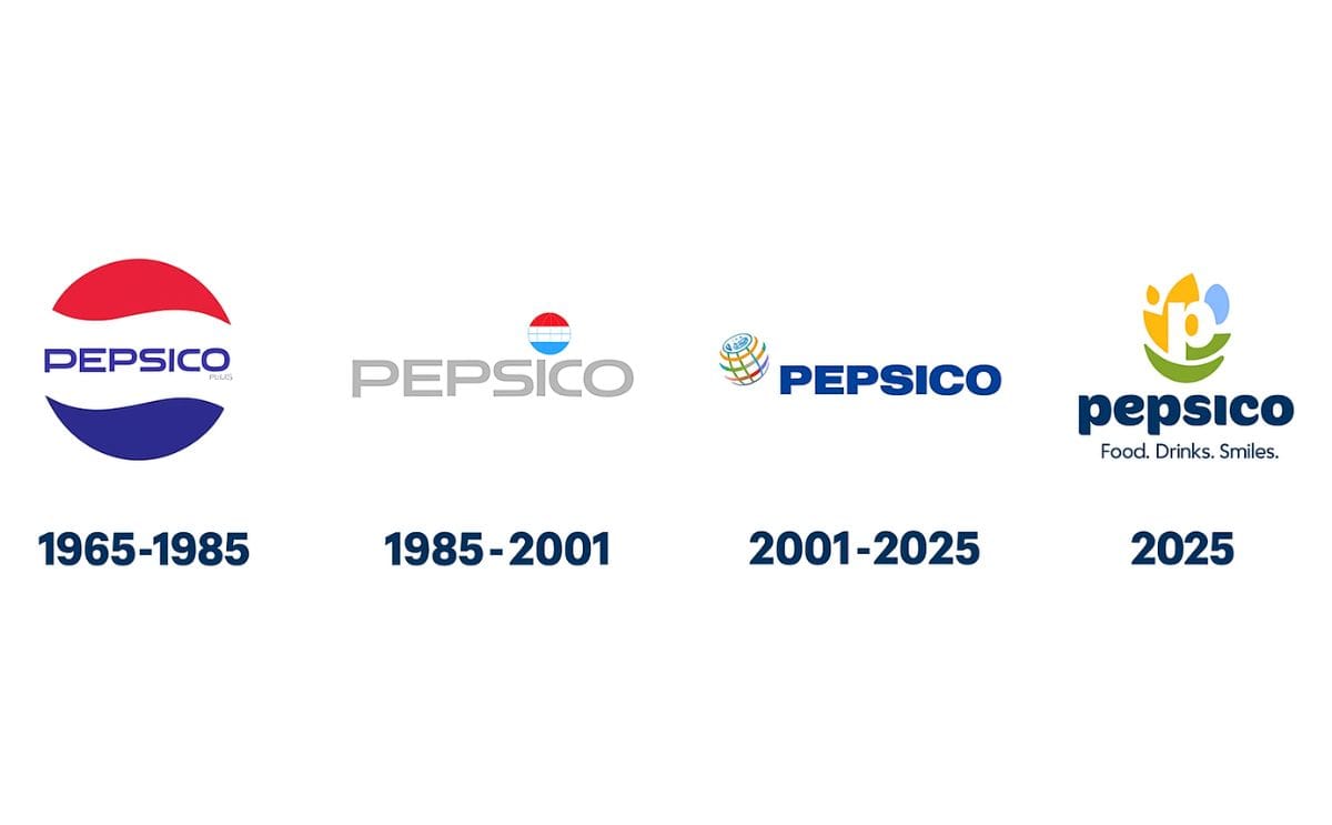
Only 21% of consumers could name any PepsiCo brand other than Pepsi. The corporate umbrella — supposed to create halo value across a vast portfolio — had effectively zero visibility. Growing from 13 brands to 500+ while leaving the parent identity frozen wasn’t just a cosmetic oversight. It was a strategic gap compounding for two and a half decades.
What Actually Changed
The 2025 identity, designed with Pentagram, dispenses with everything Pepsi-coded. No globe. No blue-red. No uppercase wordmark signaling the original soft drink hierarchy.
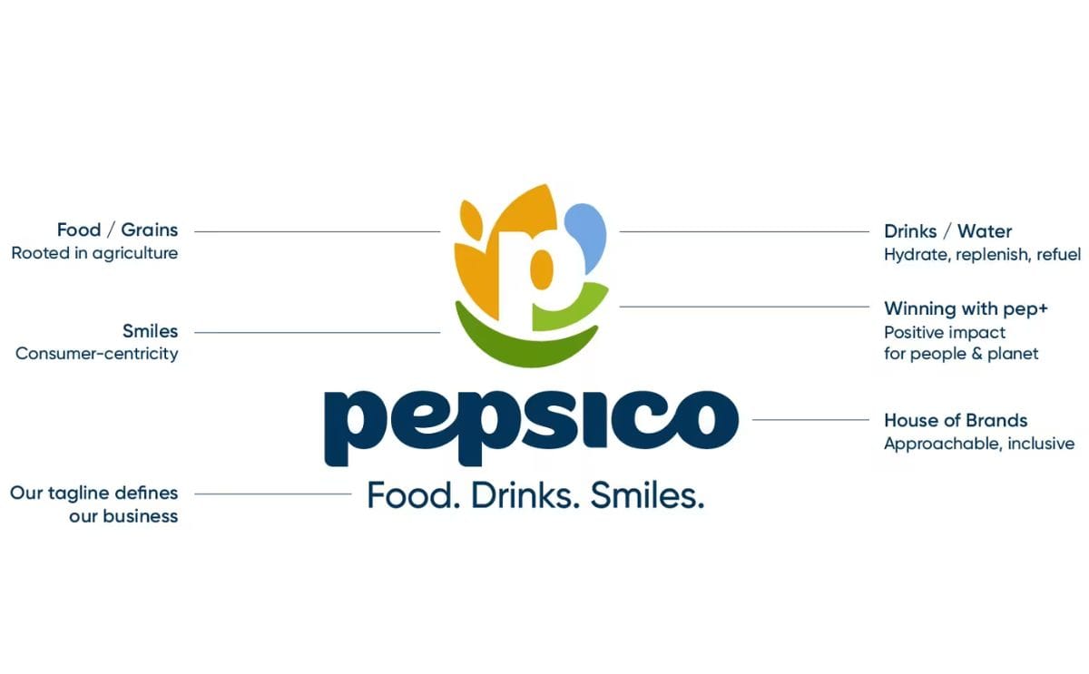
The new mark centers on a lowercase “p” surrounded by four symbolic forms: a burnt yellow grain motif (food, agriculture), a light blue water element (beverages), a green leaf (sustainability), and a forest green smile at the base. Earth tones replace the electric Pepsi palette — organic hues pulled from actual ingredients rather than soda branding conventions.
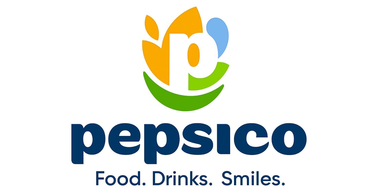
The tagline is new and deliberate: Food. Drinks. Smiles. Three words that communicate the breadth of a 500-brand portfolio. It’s the first corporate-level tagline in PepsiCo’s history.
The Architecture Decision Behind the Mark
The deeper story here isn’t visual — it’s structural. PepsiCo operated for 60 years as a house of brands: individual sub-brands (Pepsi, Gatorade, Lay’s) carried their own identities, while the corporate layer stayed largely invisible to consumers. That model works well for brand isolation — you don’t want Pepsi to feel contaminated by Quaker Oats. But it extracts a long-term cost: the parent company builds no equity of its own.
The 2025 rebrand signals a deliberate shift toward a branded house — where the corporate identity stands in front of the portfolio, lending weight to acquisitions and sub-brands rather than deferring to them. CEO Ramon Laguarta described the goal as presenting PepsiCo as “a company with expansive reach.” That reach was always there. The identity just never reflected it.
For brand managers and design agencies, this is the most instructive part: the move from house-of-brands to branded-house isn’t a stylistic preference. It’s a decision about where brand equity lives, who controls it, and how a parent company creates compounding value across its portfolio rather than letting each brand fend for itself.
Takeaway
Brand architecture debt accumulates quietly. PepsiCo spent 25 years growing while its corporate identity stood still — and the cost was a parent brand that consumers couldn’t see, even in products they used every day. The 2025 rebrand is the correction: not a refresh, but an honest accounting of what the company had actually become.