
In November 2024, Jaguar released an ad with no cars in it and broke the internet. That was the point.
The Brand Was Already Gone
Before discussing the campaign, look at the numbers. In 2017, Jaguar sold 179,000 cars globally. By 2023, that figure had dropped to 43,000 — a 75% decline. US market share: 0.05%. The brand’s core buyer was aging out, and no new generation had replaced them.
The rebrand did not cause this. The rebrand was a response to it.
Rawdon Glover, CEO of Jaguar Land Rover, put it plainly: “If we play in the same way that everybody else does, we’ll just get drowned out.” That’s a working designer’s logic, not a marketer’s spin. When you’re invisible, refinement doesn’t help. You need re-entry.
The strategic decision was clear: abandon the £50-80K segment entirely and move to electric ultra-luxury at £100K+. A new price point, a new buyer, a completely different category. That required a brand that didn’t look like the old one.
The Mechanism Behind 160 Million Views
The 30-second “Copy Nothing” film dropped on November 18, 2024. Bright models, saturated colours, no automotive product. Elon Musk posted: “Do you sell cars?” Glover replied publicly, invited him to Miami. Fox News ran segments about DEI. Design Twitter argued about the logo.
Within days: over 160 million social media impressions. Some estimates put total reach at 300 million. None of it paid.
This is the actual business case. Tropicana spent $35 million on a 2009 redesign that nobody noticed — sales fell 20% in two months when they removed the recognisable orange-with-straw. The original packaging had more equity than the brief acknowledged. Jaguar had the inverse problem: near-zero residual equity with its target audience. Nobody needed to notice the old Jaguar. There was nothing left to protect.
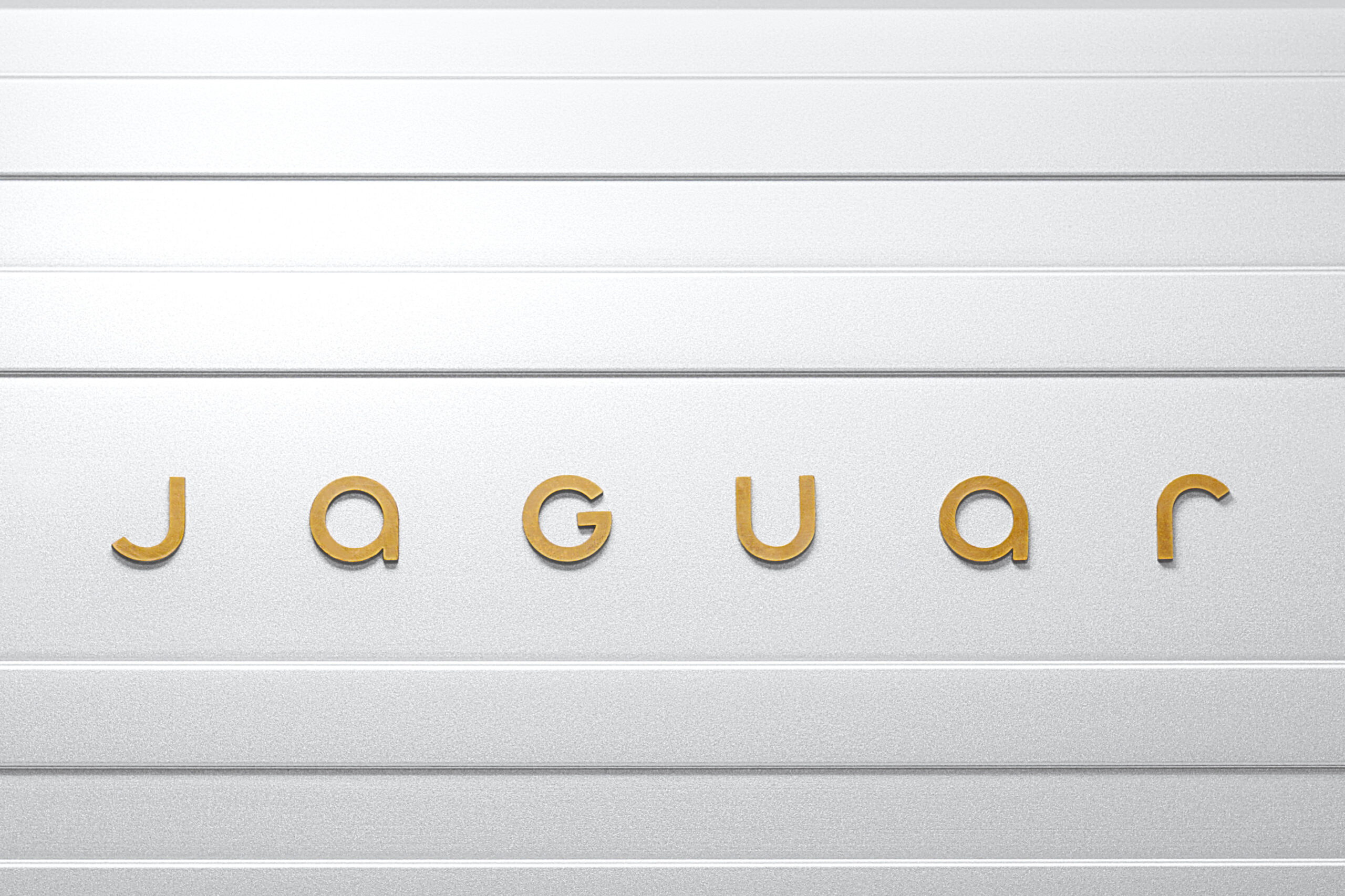
The logo — stripped wordmark, geometric uppercase letterforms, the leaping jaguar removed — was designed in-house by CCO Gerry McGovern’s team. Design critics called it “baffling rather than visionary” (Dezeen). That criticism is real. It’s also evidence that the logo register changed enough to be worth arguing about. Nobody had argued about Jaguar’s logo in years.
Why Backing Down Would Have Been the Actual Failure
Three recent rebrand reversals show the other path:
Gap reversed their logo redesign in 6 days in 2010, becoming a shorthand for corporate cowardice. Cracker Barrel walked back a decision under social pressure in 2025 and lost over $100M in market capitalisation with nothing to show for it. Tropicana retreated immediately — and that retreat confirmed the original brand team was wrong to try.
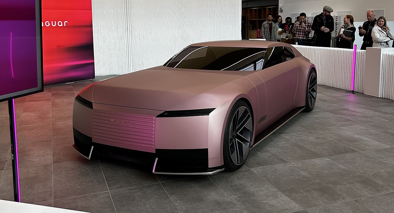
Jaguar held the line. By December 2-3, the Type 00 concept appeared at Miami Art Week — not a motor show. That venue choice was itself the message: this brand now lives in art-luxury territory, competing with Ferrari and Porsche, not matching specs with BMW.
The holding pattern worked because of one structural condition: there was a real car coming. The backlash period wasn’t a gap — it was a runway. A controlled burn only works if there’s something to build on the cleared ground.
Takeaway
A brand with 0.05% market share and a declining buyer base is not a brand that needs careful stewardship. It needs a reason for someone new to pay attention. Obscurity is a slower death than controversy, and harder to recover from — because nobody writes about it.