The FedEx logo has a hidden arrow in it — and the moment you see it, you feel something. That feeling is worth approximately $1 billion in brand equity. That’s the entire argument for symbolic depth.
The Aha Moment Is a Business Asset
When Lindon Leader designed the FedEx logo in 1994, the CEO didn’t notice the arrow between the E and x. Neither did most people, for a while. That restraint — keeping the symbol quiet, never announcing it — was itself a deliberate choice. EEG research now confirms what brand professionals have observed anecdotally: logos with hidden elements activate more brain regions during viewing. The viewer who discovers the symbol feels rewarded. They feel clever. They feel, briefly, like an insider.
That emotional transaction is not a design trick. It is a relationship between brand and audience, engineered into negative space. And it works precisely because the FedEx arrow isn’t just decorative cleverness — it says “speed and precision,” which is what customers are literally paying for.
The Amazon smile arrow does the same work in three directions simultaneously: it connects A to Z (we sell everything), it forms a smile (customers are happy), and it creates a forward-moving shape (momentum). If a symbol only does one job, you’re wasting visual real estate.
Strategy First, Symbol Second
Here’s where most attempts at symbolic depth fail. A financial firm once embedded an Ouroboros — a snake eating its own tail — thinking it conveyed infinity and continuity. To any educated viewer, it read as self-destruction. Intent does not determine meaning; cultural load does. Symbols accumulate significance from history, context, and repetition. The mark will mean what people already know it to mean.
The discipline of symbolic thinking, when applied correctly, forces a question that copywriting often lets founders avoid: what is the single thing this brand must mean? Not the three things, not the values document — the one compressed truth. Minimalism is not subtraction. It is distillation. Boiling a brand to its undiluted essence is harder than adding elements, and it demands strategic clarity before a single form is drawn.
The sea of sameness — abstract hexagons, three ascending bars, two letters inside a circle — exists because it is easier to add geometry than to decide what geometry should mean.
The Mark Is the End of Thinking, Not the Beginning
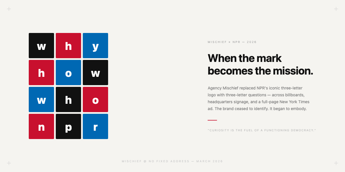
In 2026, agency Mischief replaced NPR’s iconic three-letter logo with three-letter questions: WHY. HOW. WHO. Across billboards, headquarters signage, and a full-page New York Times ad, the brand’s identity ceased to identify and began to embody. The mark became the mission. “Curiosity is the fuel of a functioning democracy,” said NPR’s CMO. The symbol didn’t explain that — it enacted it.
In the same month, Merciv — a data intelligence startup post a $14M seed round — released a mark that encodes its entire product proposition in geometry: circles (fragmented data) transform into bars (actionable insight), with a trend line and an M silhouette built into the composition. Every element does analytical work. It is not art. It is a visual argument for what the product does.
This is what founders and brand managers miss when they brief for a logo before they’ve resolved their positioning: the mark cannot compress something that hasn’t been clarified. The logo is the output of strategic thinking, not the start of it. Get to the one true thing. Then ask whether your mark — in its negative space, its proportions, its secondary reading — captures it or merely decorates it.
Takeaway
The brands that earn discovery build marks that reward a second look. But symbolic depth is not a stylistic choice — it is a strategic one. Every hidden element must serve the brief. If it doesn’t speak to what the brand actually does or means, it’s self-indulgence in vector form.