
Most rebrands change how a company looks. BBH’s first visual overhaul in 44 years changed what a visual identity can carry.
Three Founders, Three Typefaces, One Argument
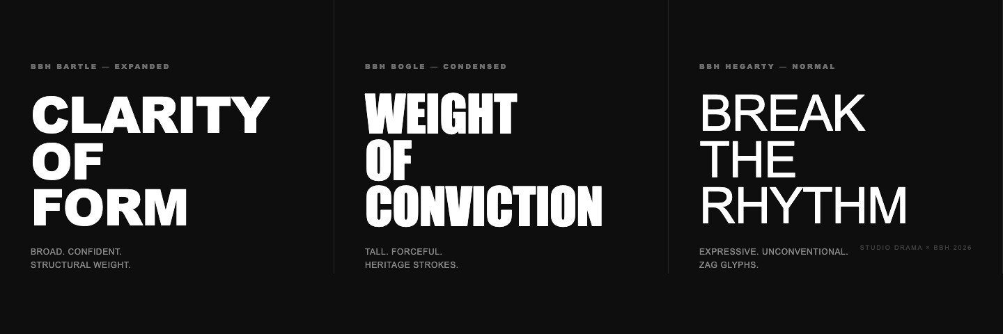
Bartle Bogle Hegarty didn’t brief an agency to find a font that felt “more them.” They commissioned Studio DRAMA to build three bespoke typefaces from scratch — each one a direct translation of a founder’s temperament into letterform.
BBH Bartle is structural, broad, confident — the visual equivalent of John Bartle’s clarity of thought. BBH Bogle carries the weight of the original 1982 logo, its heavier strokes echoing Sir Nigel Bogle’s conviction. BBH Hegarty is expressive, unconventional, built to break rhythm — Sir John Hegarty’s creative irreverence made typographic.
The decision to name each typeface for a founder isn’t nostalgic. It’s structural. It means every time the identity system is used, three distinct points of view are present and legible. The founders become the system.
This took two years to resolve. Studio DRAMA — the same studio behind the Heinz typeface — spent months turning hundreds of scribbles into three coherent type families. The timeline is its own statement: this is a rebrand as a piece of craft, not a brand sprint.
Encoding Dissent at the Character Level
BBH Hegarty includes something the other two don’t: Zag glyphs. These are custom alternate characters, each one visually distinct and tied to a specific BBH project or moment. They don’t replace type — they interrupt it.
Chris Nott, type director at Studio DRAMA, put it plainly: “The ‘Zag’ alternates let us hardwire the black sheep mindset directly into the font. Used sparingly, they allow the type to break convention in all the right ways.”
This is the difference between decorative and systematic. A logo can signal difference once. A glyph set that activates dissent every time someone types is a mechanism — it keeps the philosophy in circulation across every touchpoint, indefinitely. The identity doesn’t just represent the value. It performs it.
Giving It Away Was the Most On-Brand Move
BBH released all three typefaces as free downloads on Google Fonts. Within weeks, 4 million people had downloaded them.
ECD Felipe Serradourada Guimarães: “We made the BBH typeface free to the world. We didn’t want it to just be our difference. We wanted other designers, creatives, people to use it out there in the real world and find their own. That felt like the most honest version of zagging.”
For brand managers who treat proprietary assets as competitive moats, this is worth sitting with. The move that looks like giving something away embedded BBH’s identity into millions of design workflows. The font now exists everywhere — in projects, portfolios, and campaigns that have nothing to do with BBH. The brand is present without the brand needing to be there.

Guimarães also framed the rebrand as a direct counter to the current moment: “We are doubling down on Zag in the face of the sloppy AI sameness.” For agencies and brand managers watching clients default to generic AI-generated visuals, BBH’s move is a brief disguised as a launch.
Takeaway
A visual system strong enough to carry your values doesn’t need to be guarded — it needs to be deployed. BBH didn’t refresh its identity; it authored one that behaves like the brand does: argues its case, breaks convention by design, and gives itself away to prove the point.