
For nearly a decade, brand teams reached for neutral grotesques by default. That reflex is now working against them — and one independent type studio has become the clearest case study for why.
The problem with playing it safe
The safe grotesque made sense as a brand default. It was legible, scalable, inoffensive. It also made every brand look like every other brand.
Advise Graphics put it plainly in their 2026 typography forecast: “For the better part of a decade, we’ve been living in the era of the homogenized grotesque.” When your typeface could belong to any of fifty competitors, it is not doing brand work. It is doing placeholder work.
The correction has arrived. In 2026, the dominant move in serious brand design is treating type as a primary image element — not a support layer. Studio Dumbar, Collins, Turner Duckworth and others are building identities where the typeface carries the visual argument outright. The font is not dressing. It is the concept.
What Contrast Foundry gets right
Contrast Foundry (CoFo), founded by Maria Doreuli in 2014, sits in an unusual position: a retail type studio whose work regularly ships inside brand systems at Nike, Coca-Cola, TikTok, Collins, Pentagram, BBDO and Google. That list is not decorative. It tells you this is a studio whose typefaces function under real brand pressure — multiple languages, multiple media, multiple scales.
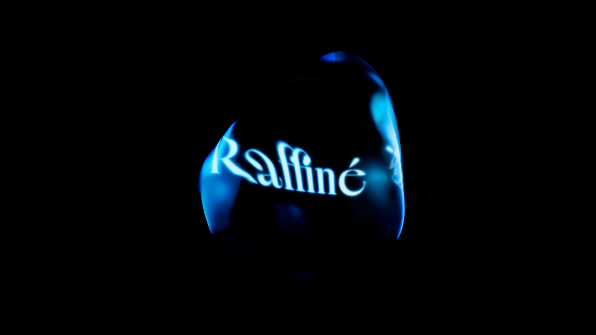
Their 2026 Tokyo TDC win for CoFo Raffine adds awards credibility, but the more useful signal is who keeps hiring them. Agencies and in-house teams return to CoFo because the typefaces are designed to carry meaning. There is visual argument built into the letterforms.
Inline and display type as a strategic signal
CoFo Holz — designed by Nikita Sapozhkov, released 2024 — is the clearest example of where this goes. It draws from 18th-century engravings and the American Wood Type archive compiled by Rob Roy Kelly. The result: triangular wedge serifs, a sharp-versus-soft tension in the strokes, inline detail that reads as historical but renders as entirely contemporary.
This is what type researchers are calling the Mutant Heritage trend: typefaces that carry the weight of a historical reference while behaving like contemporary design tools. For a brand team, it means visual specificity that a neutral grotesque cannot deliver. You are not picking a style. You are staking a position.
The strategic question is not whether inline or display type is trending. It is whether the character in the typeface is doing work your strategy actually needs. If the brief calls for authority, craft, or cultural depth — that is where expressive type earns its fee.
Variable fonts as brand design tokens
There is also an operational argument. CoFo Sans Pro is variable, with full Cyrillic support. CoFo Sans Mono Variable is available on Adobe Fonts. In 2026, the agencies building scalable brand systems treat variable font axes — weight, width, optical size — the same way they treat color tokens: defined at the system level, not decided asset by asset.
A single variable font file replaces ten to twenty static files. It prevents layout shifts across digital touchpoints. It gives brand managers a coherent typographic range without commissioning a new weight every time the brief changes. For startup founders licensing type for the first time, this is the ROI argument alongside the aesthetic one.
When expressive type fits — and when it does not
Not every brand needs CoFo Holz. The decision framework is simpler than it looks:
- If your market is already legible and differentiation is the brief, expressive type pays off.
- If your category is in flux and you need to signal craft or depth, inline and display type signals that faster than most other choices.
- If your brand system spans multiple languages, Cyrillic support and OpenType completeness are non-negotiable — check before you fall for a specimen.
- If your team is still managing a drawer of static font files, the variable font conversation is overdue regardless of which foundry you choose.
Elliot Jay Stocks, writing in Print Magazine this month, framed it well: “Just getting by has never been easier. Getting it right has never been harder.” That is exactly the condition that makes character in type worth paying for.
Takeaway
The grotesque default was never neutral — it was a choice that said nothing. In 2026, with AI capable of generating passable type on demand, the craft foundry that makes a deliberate visual argument is not a luxury. It is the differentiation.